
Back
Background
For this project, I was tasked with redesigning a website for a company local to Ann Arbor. Blank Slate is a creamery located in Ann Arbor known for its unusual ice cream flavors and dedication to making its own ice cream. On summer nights, you can often find the store with an hour long line to get some of its delicious ice cream.
Right now, Blank Slate does not have a clear description of their unusual flavors. Users are unclear how to order ahead of time, or what the flavors taste like, leading to long lines as users wait to taste all the flavors they would like to try. This adds to user stress, and in some cases can cause users to walk away before ever getting into the store.
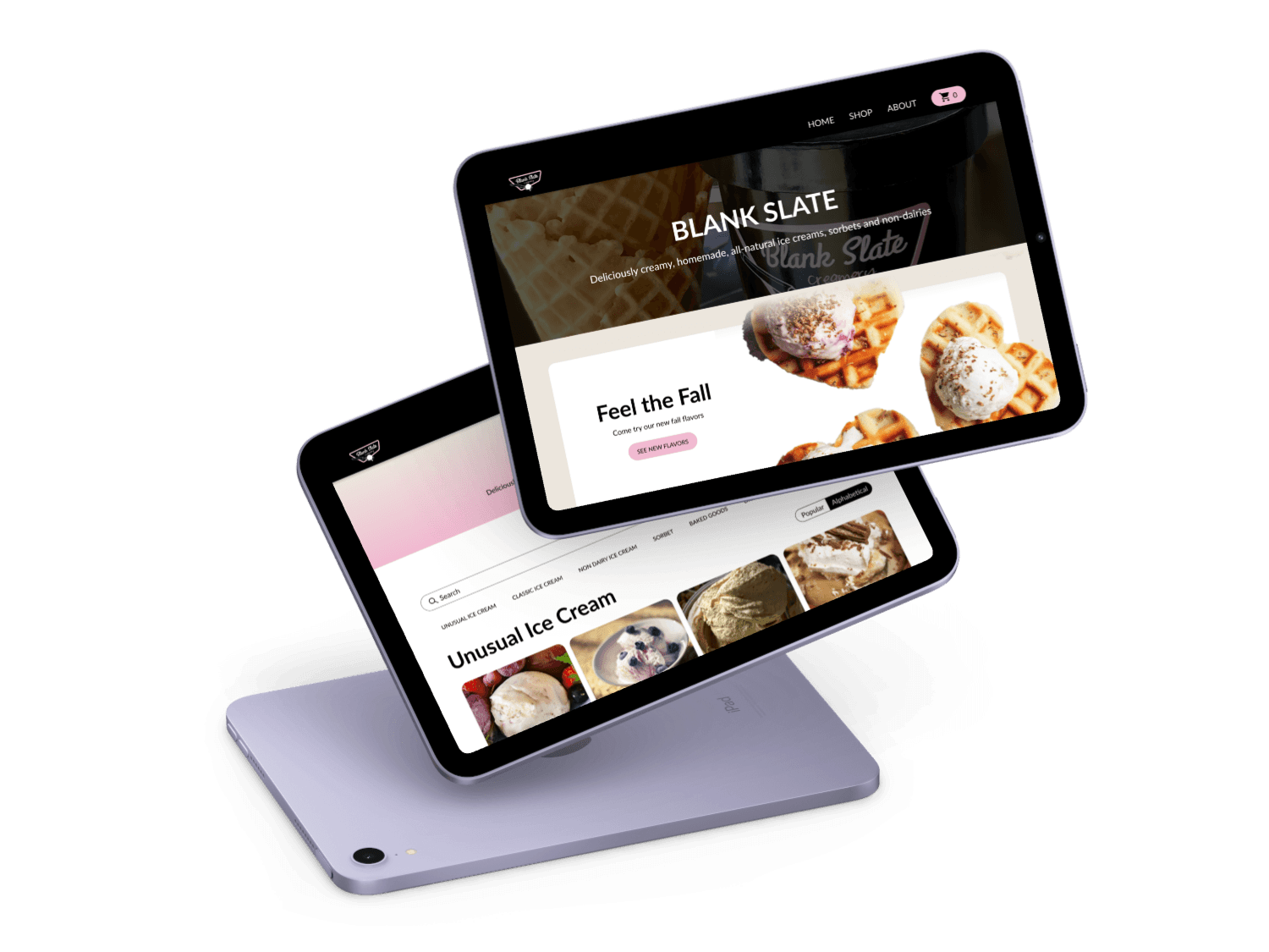
Interactive Final Prototype
For my final design, I prioritized an intuitive user flow and clear descriptions/visuals of ice cream flavors and other products. These changes allowed users to order online more quickly, and also understand how flavors tasted more quickly. With these changes, users will be able to spend less time making decisions while trying to order, speeding up lines and increasing user satisfaction.
Design Process
User Research
To begin this project, I wanted to get an in depth understanding of Blank Slate's current business model and website. To do this, I conducted stakeholder interviews, customer observations, and a heuristic evaluation of Blank Slates website. These research processes were helpful because they helped me understand the mindset of the users as they proceeded through the store, and also begin to identify friction points with the current design.
To better view the image on the right: https://drive.google.com/file/d/1PpQiesMFET2muw7dlkGzE0hjmdWzV809/view?usp=drive_link


Journey Maps and Product Vision Boards
After conducting in depth user research, I compiled my findings into a Journey Map and Product Vision Board.
I found that the main pain point users faced was that they had no idea how the flavors tasted before they tried them, which led to longer wait lines as users tasted, and more customer confusion.
Sketches
To solve this problem of users not knowing what to order, I wanted to prioritize presenting Blank Slate's flavors online in a way that users could understand what a flavor tasted without trying it.
I did a crazy 8s exercise to flush out my ideas, and decided on a flavor-first presentation.


Design System
Before I began designing, I pulled out the primary colors and fonts from the original website to stay true to Blank Slate's brand identity. To ensure that the website was accessible, I made sure the elements were in line with accessibility and color contrast standards.
I created buttons and other basic components to streamline my design process.
First Iteration Product Screens
After all of the setup, I began designing my responsive checkout flow with breakpoints for desktop and mobile devices.
From my user research and my journey mapping, I knew that I needed to prioritize how flavors were presented. To do this, I added images of every flavor Blank Slate had, and divided the flavors into groups to help make the long list more palatable for users. I also provided ingredient descriptions, and dietary restrictions for each flavor. I wanted users to be able to understand exactly how the flavors tasted (or as close as possible) before they ordered.
Beyond presenting the flavors more clearly, I also streamlined the navigation of the website into a three part navigation. This made it so users could order the product more seamlessly.

User Testing
To put this new user flow to the test, I conducted user testing on the newly prototyped website and Blank Slate's original website. I wanted to test that users would be able to order the ice cream flavor that they wished easily, and have a good understanding of the flavor they were getting.
To understand if I had improved the website without biasing the individuals with the original website, I presented testers with the prototype first, and had them complete the task of ordering a scoop of ice cream.
Tasks were kept the same across both platforms to emphasize differences in the websites.


Affinity Diagraming
After user testing, I compiled all of the comments I received into categories so I could understand what changes I needed to make.
Users were easily able to order the flavor they would like on the new website, but ran into issues on the old website. On the new website, all users also said that they would have a good understanding of what the flavor tasted like before buying because of the photos and the ingredient list.
"It gave you the ingredients, so definitely the [redesign] was a lot easier and a lot favorable." - tester
Revised Product Screens
With the feedback that I gathered from my user testing and also from professors, I made changes to my prototype. Key changes I made are: Adding more space around the flavors, making homepage text more readable, and adding an order summary to the order confirmation page. I also fixed some issues with the prototyping flow.

Annotations
After finalizing my designs, I added annotations to ensure a clear transition to development for a future tech team. I also added in error messages and alternative text to prioritize accessibility in the design.

Before and After Comparisons
Conclusion
Research Findings
From my research, I discovered that the main pain point users were experiencing derived from an inability to understand the flavors Blank Slate had without trying them. Users were also unable to figure out how to order ice cream online. This lead to long lines, and customer frustration.
Before redesign, users were unable to figure out how to order a scoop of ice cream online, and had to wait in long lines to understand what flavors tasted like.
When presented with a clear ingredient list and imagery of flavors, users are able to understand what flavors taste like without trying them. Provided with clear navigation, users were able to find the products they wanted to order. This leads to a quicker checkout process, and therefore easier sales.