
Back
Background
For this project, we were tasked with creating an application that provided a solution for University of Michigan students to find events and organizations. "The Diag" is an application we developed to solve this issue.
Right now, events at the University of Michigan are hard to find and keep track of. Students struggle to discover evens relevant to them, see key details in one place, and keep track of what they have RSVPd to or attended. We asked: "How might we increase visibility of campus organizations and events to encourage engagement in the larger community"
Meghan Hoffman, Anthony Shephard, Sarah Crabtree, Moira Hix, Jake Hirschberg
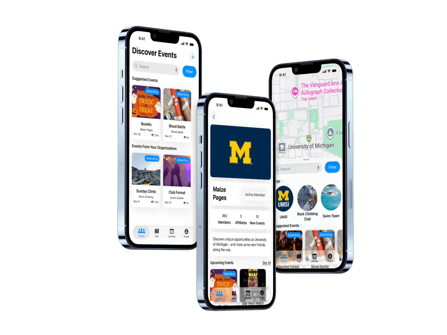
Interactive Final Prototype
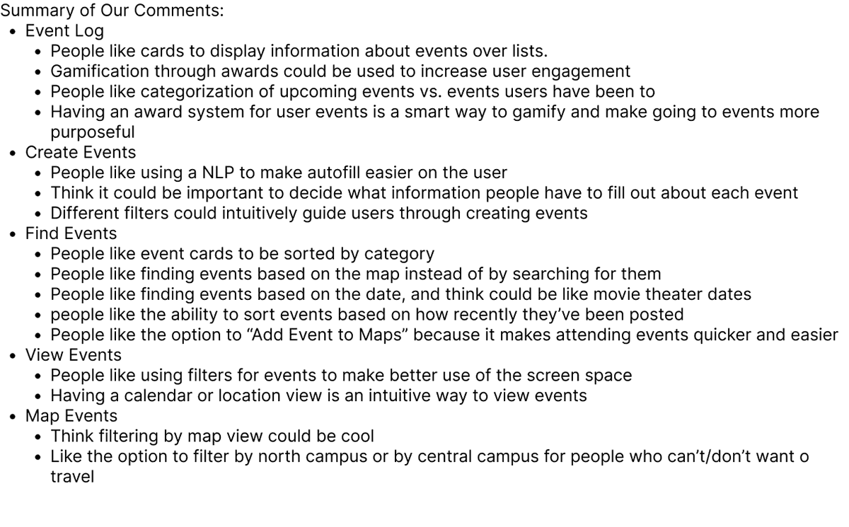
For our final design, we prioritized an intuitive user flow, with clear access to events happening on campus. These changes allowed the users to find events they would like to attend more quickly, and also discover other events on campus. With these implementations, users will be able to find events they would like to attend, keep track of events more easily, and be rewarded for event attendance, increasing engagement across campus.
Key Improvements:
• Centralized Event Discovery Feed
• Map Based Navigation for Location-driven Decisions
• Gamified Attendance Badges to Reward Engagement
Design Process
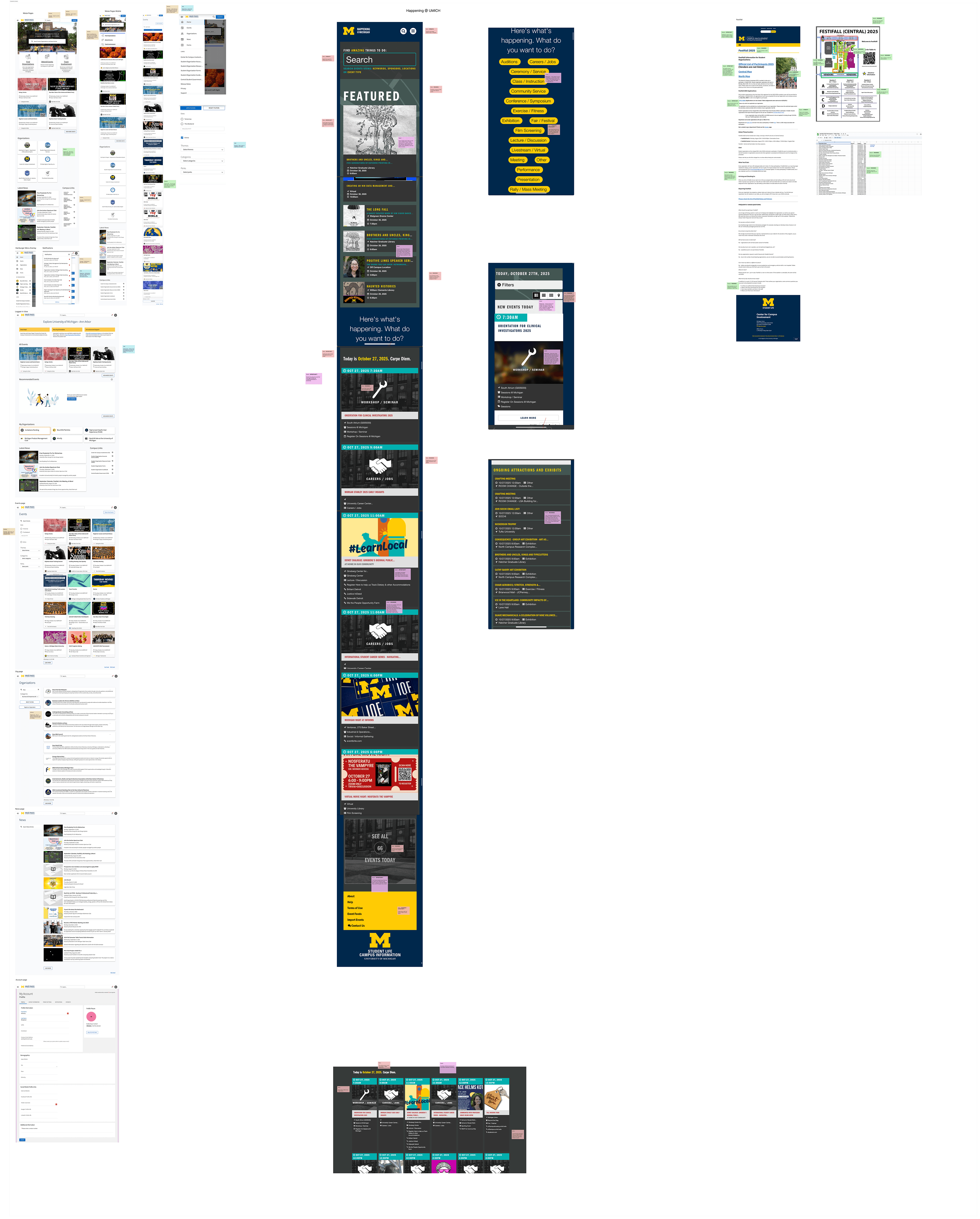
Competitive Research
To begin this project, we wanted to get an in depth understanding of the current system of finding events on campus. To do this, we conducted competitor research on Maize Pages, Happening @ UMICH, and the Festifall website. These research processes were helpful because they helped us understand the mindset of the users as they search for events, and also begin to identify friction points with the current options.
We chose to use this research method because it provided us with the most clarity to websites students were currently using and their pain points.
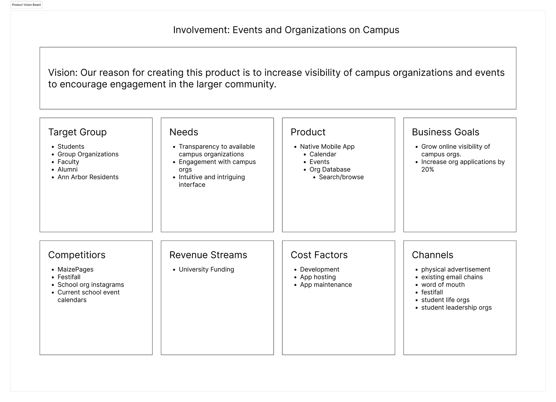
Product Vision Board and Insights
After conducting in depth user research, we compiled our findings into a Product Vision Board.
We found that the main pain point users faced were that websites are often oversaturated with information, overwhelming users, and preventing them from finding events they are interested in. We also found that students needed a map to help them locate the events they would like to find.
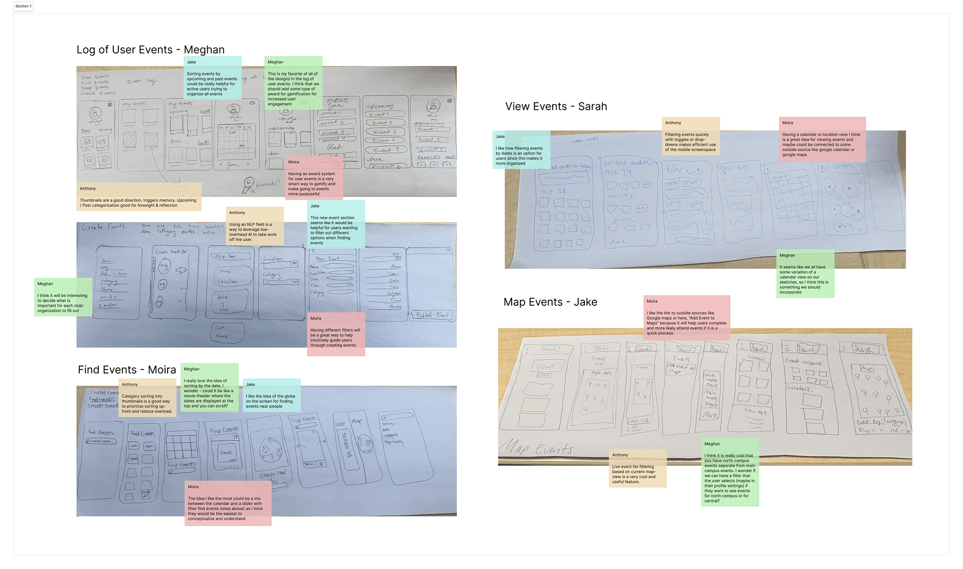
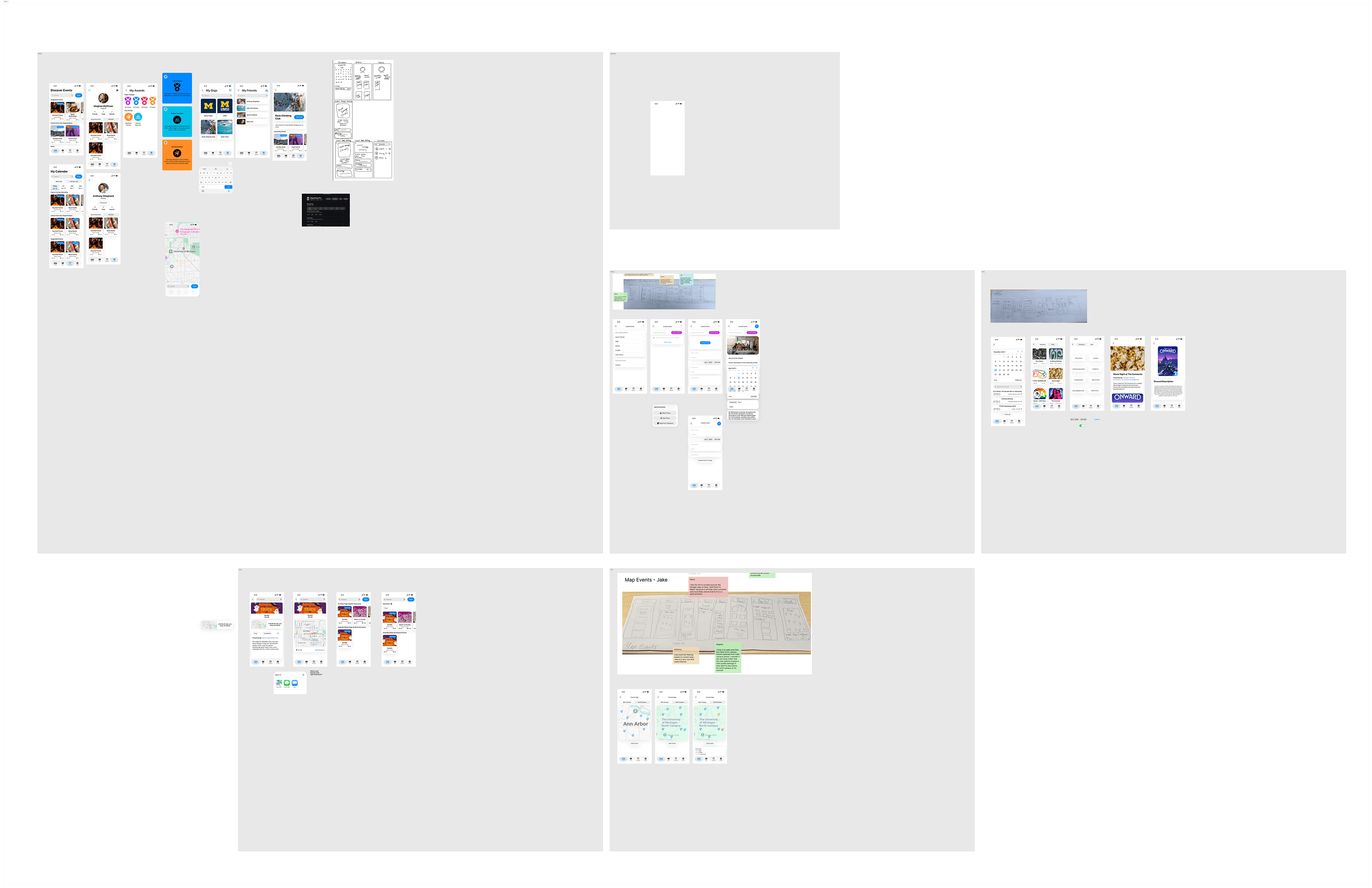
Sketches
To solve this problem of users not being able to find events, we wanted to prioritize presenting events in a concise and informative way that would allow them to find the events and organizations they would be interested in participating in.
We did a Crazy 8s exercise to flush out our ideas, and decided on 4 main pages: find events, map, my calendar, and my profile.
After sketching, we compiled a list the key features we would like on each page.
Design System
Before we began designing, we made the decision to use Apple's IOS library for our design basis. We followed the iOS Human Interface Guidelines for tab bars, navigation, colors, and typography, using SF Symbols and system type scales.
We created buttons and other basic components to streamline our design process.
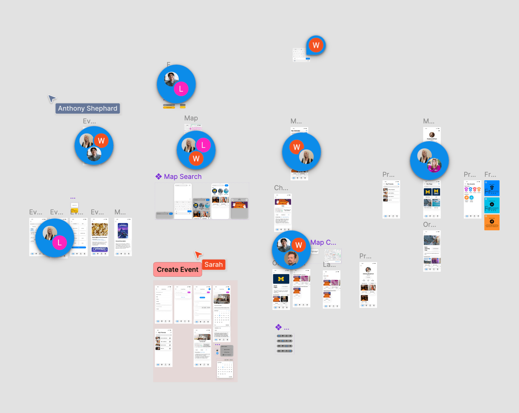
First Iteration Product Screens
After all of the setup, we began designing our responsive mobile application.
From our competitor research and vision board, we knew that we needed to prioritize how events were presented. To do this, I we images of events, as well as their organizations, date, and location distance to help users understand the event details. We divided events into ones suggested to users to increase discoverability. We also created an event and organization detail page that allowed users to learn more about what they want to attend.
Beyond allowing users to view events and organizations more clearly, we also created awards for users who engaged in a certain number of events to increase involvement across campus.
User Testing and Peer Review
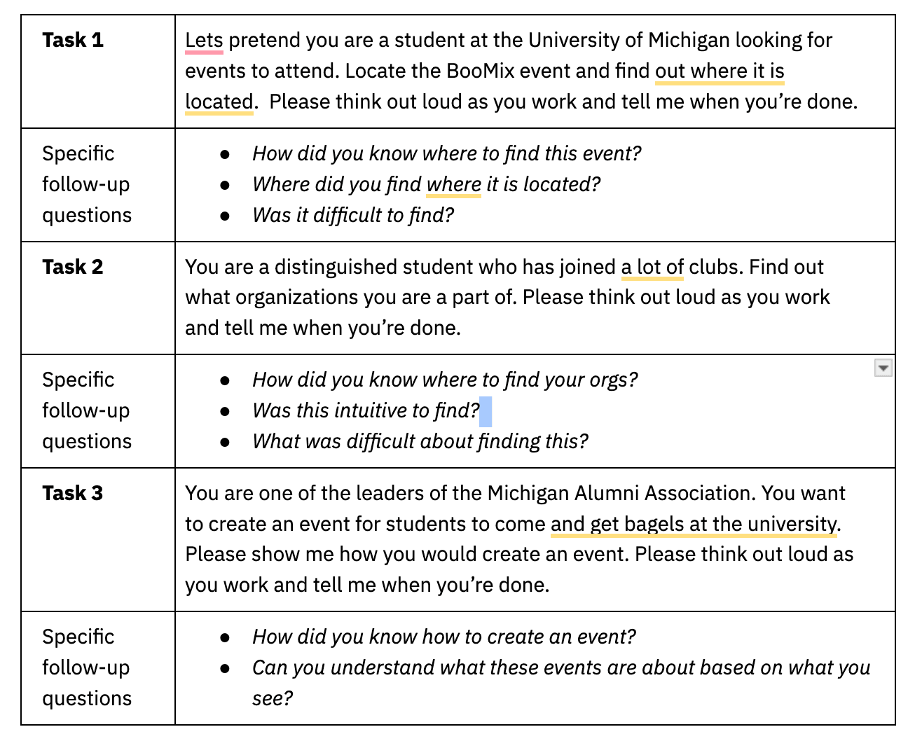
To put this new application to the test, we conducted user testing on the newly prototyped designs. We wanted to test that users were able to find details about events, create events, find the organizations they are a part of, and track their engagement. To do this We tasked users with finding the BooMix event, checking the number of organizations they were a part of, and to creating an event.
From this test we found that all five participants quickly found event details, but three out of five hesitated when creating an event.
We also asked our peers to review our designs and leave comments on areas they thought we should improve.

Affinity Diagraming
After user testing, we compiled all of the comments we received into categories so we could understand what changes we needed to make.
Users were easily able to find details for the events they needed to attend, and were also able to find the organizations they were a part of. However, users had difficulty creating events. There were also aspects of the prototype that malfunctioned that we needed to fix.
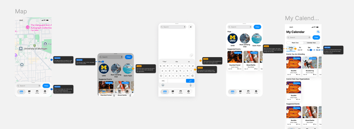
"I wish you could tap on the address and be taken to maps." - tester
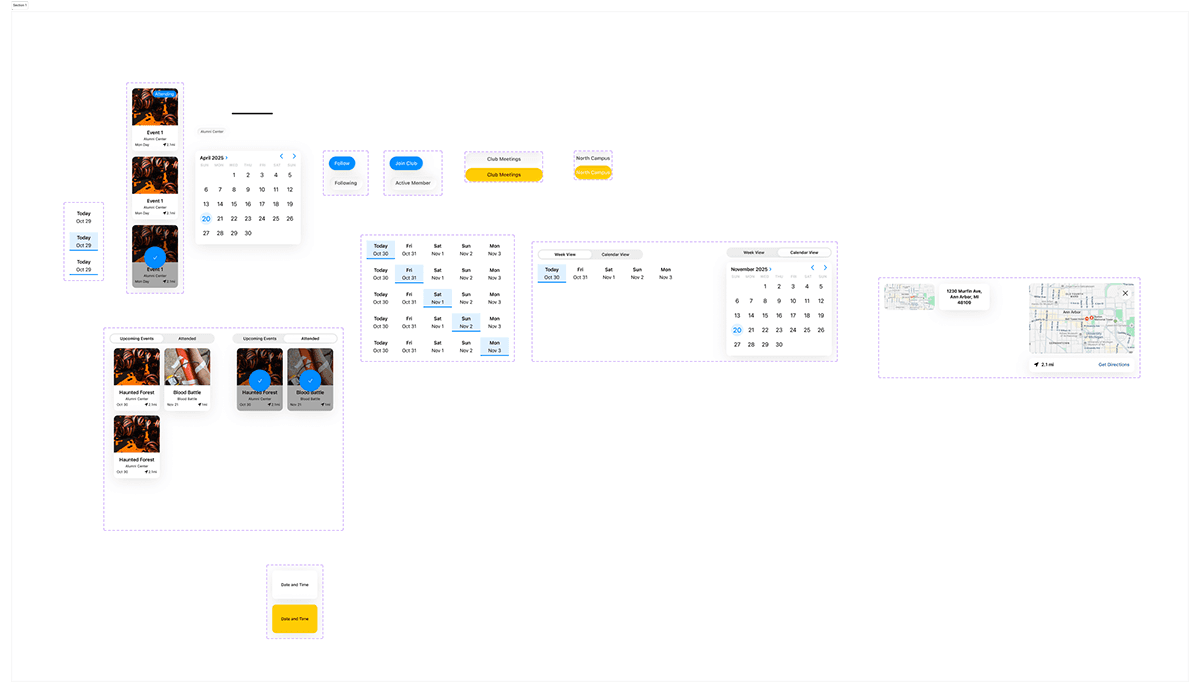
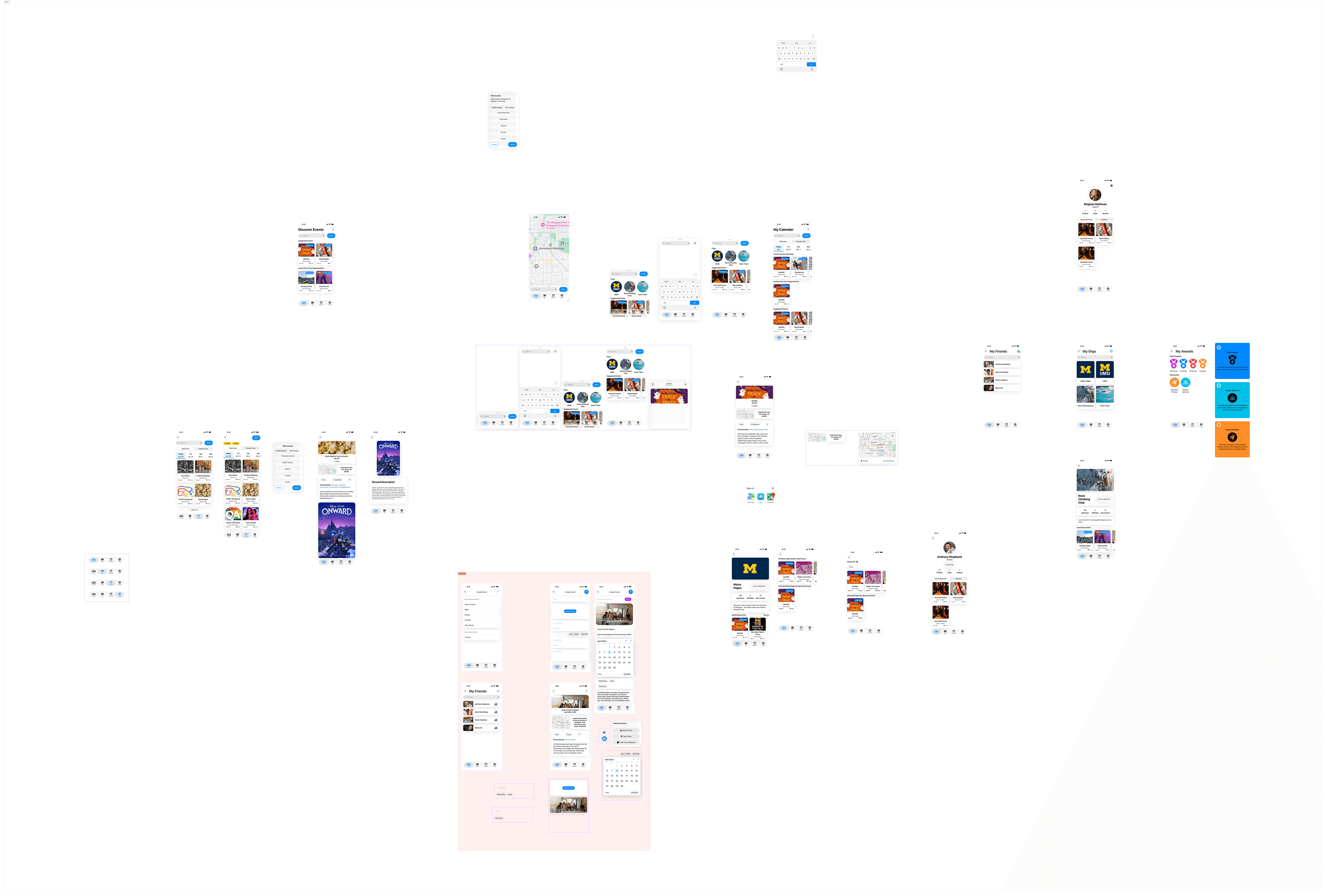
Revised Product Screens
With the feedback that we gathered from our user testing and also from professors, we made changes to our prototype. Key changes we made are: Fixing the create event user flow, fixing the create event button, fixing organization tags on events, adding a map expansion, and making attendance clearer. We also fixed the issues with the prototyping flow.
Annotations and User Stories/Epics
After finalizing my designs, we added annotations and wrote our user stories and epics to make sure our designs told a clear story for development. We also added in error messages and alternative text to prioritize accessibility in the design.

The Final Model
Conclusion
Research Findings
From our research, we discovered that the main pain point users were experiencing derived from an inability to find events relevant to them. Users were also unable to figure out how where and when events were happening, and what events were available for them to attend. This led to decreased participation in activities on campus.
Before "The Diag," users were unable to figure out where and when events were happening on campus and had to rely on emails, group me, slack, and disorganized websites to find the events they wanted to attend.
When presented with a clear list of events, users are able to understand what events they are able to attend, and what organizations they might want to join. This leads to easier access to events, and therefore higher campus engagement.